11:33 ص
0

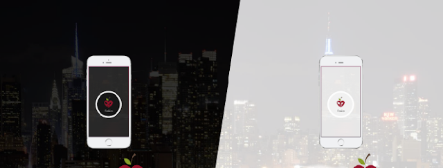
دعونا نتحدث عن اضافتنا هاته والتي تتكون من 13 شكلًا كل ستايل يلهيك عن الآخر
 وجميعها مصممة بالـCss فقط وقررت أن أضع اجزاء قد تصل لأربعة اجزاء لأني وجدت العديد والعديد من الأشكال الرائعة حقا ولا أطيق صبرا لمشاركتها معكم بعد أن أجهزها... لذا لن أطول أكثر سأترككم مع المعاينة أولا، استمتعوا!
1. حرر القالب >> ابحث بالاستعانة بـ Ctrl+F عن <body>
2. ضع الشكل المختار أسفله
* لتغيير لون الخلفية فلونها محدد بالأحمر - اضغط هنا لأكواد الألوان
* يوجد في الخلفية شفافية لمن أراد حذفها فالكود محدد بالأخضر
الشكل 1
<style>
#ar1web-loader{position:fixed;top:0;left:0;right:0;bottom:0;background:#060606;z-index: 99999; opacity: .95;}
.ar1web-spinner { text-align: center; position: absolute; top: 50%; left: 50%; margin: -30px 0 0 -40px; width: 40px; height: 40px; background-color: #fff; -webkit-animation: sk-rotateplane 1.2s infinite ease-in-out; animation: sk-rotateplane 1.2s infinite ease-in-out; }
@-webkit-keyframes sk-rotateplane { 0% { -webkit-transform: perspective(120px) } 50% { -webkit-transform: perspective(120px) rotateY(180deg) } 100% { -webkit-transform: perspective(120px) rotateY(180deg) rotateX(180deg) } }
@keyframes sk-rotateplane { 0% { transform: perspective(120px) rotateX(0deg) rotateY(0deg); -webkit-transform: perspective(120px) rotateX(0deg) rotateY(0deg) } 50% { transform: perspective(120px) rotateX(-180.1deg) rotateY(0deg); -webkit-transform: perspective(120px) rotateX(-180.1deg) rotateY(0deg) } 100% { transform: perspective(120px) rotateX(-180deg) rotateY(-179.9deg); -webkit-transform: perspective(120px) rotateX(-180deg) rotateY(-179.9deg); } }
</style>
   <script type="text/javascript">
        $(window).load(function () {
            setTimeout(function () {
                $(".ar1web-spinner").fadeOut("slow");
                setTimeout(function () {
                    $("#ar1web-loader").fadeOut("slow")
                }, 1000)
            }, 1000)
        });
    </script>
<div id="ar1web-loader">
    <div class="ar1web-spinner"></div>
</div>
الشكل 2
<style>
#ar1web-loader{position:fixed;top:0;left:0;right:0;bottom:0;background:#060606;z-index: 99999; opacity: .95;}
.ar1web-spinner { text-align: center; position: absolute; top: 50%; left: 50%; margin: -30px 0 0 -40px; width: 40px; height: 40px;}
.ar1webcube1, .ar1webcube2 { background-color: #fff; width: 15px; height: 15px; position: absolute; top: 0; left: 0; -webkit-animation: sk-ar1webcubemove 1.8s infinite ease-in-out; animation: sk-ar1webcubemove 1.8s infinite ease-in-out; } .ar1webcube2 { -webkit-animation-delay: -0.9s; animation-delay: -0.9s; }
 @-webkit-keyframes sk-ar1webcubemove { 25% { -webkit-transform: translateX(42px) rotate(-90deg) scale(0.5) } 50% { -webkit-transform: translateX(42px) translateY(42px) rotate(-180deg) } 75% { -webkit-transform: translateX(0px) translateY(42px) rotate(-270deg) scale(0.5) } 100% { -webkit-transform: rotate(-360deg) } }
 @keyframes sk-ar1webcubemove { 25% { transform: translateX(42px) rotate(-90deg) scale(0.5); -webkit-transform: translateX(42px) rotate(-90deg) scale(0.5); } 50% { transform: translateX(42px) translateY(42px) rotate(-179deg); -webkit-transform: translateX(42px) translateY(42px) rotate(-179deg); } 50.1% { transform: translateX(42px) translateY(42px) rotate(-180deg); -webkit-transform: translateX(42px) translateY(42px) rotate(-180deg); } 75% { transform: translateX(0px) translateY(42px) rotate(-270deg) scale(0.5); -webkit-transform: translateX(0px) translateY(42px) rotate(-270deg) scale(0.5); } 100% { transform: rotate(-360deg); -webkit-transform: rotate(-360deg); } }
</style>
   <script type="text/javascript">
        $(window).load(function () {
            setTimeout(function () {
                $(".ar1web-spinner").fadeOut("slow");
                setTimeout(function () {
                    $("#ar1web-loader").fadeOut("slow")
                }, 1000)
            }, 1000)
        });
    </script>
<div id="ar1web-loader">
  <div class="ar1web-spinner">
  <div class="ar1webcube1"></div>
  <div class="ar1webcube2"></div>
</div>
</div>
الشكل 3
<style>
#ar1web-loader{position:fixed;top:0;left:0;right:0;bottom:0;background:#060606;z-index: 99999; opacity: .95;}
.ar1web-spinner { text-align: center; position: absolute; top: 50%; left: 50%; margin: -30px 0 0 -40px; width: 40px; height: 40px; -webkit-animation: sk-rotate 2.0s infinite linear; animation: sk-rotate 2.0s infinite linear; }
.ar1webdot1, .ar1webdot2 { width: 60%; height: 60%; background-color: #fff; display: inline-block; position: absolute; top: 0; border-radius: 100%; -webkit-animation: sk-bounce 2.0s infinite ease-in-out; animation: sk-bounce 2.0s infinite ease-in-out; }
.ar1webdot2 { top: auto; bottom: 0; -webkit-animation-delay: -1.0s; animation-delay: -1.0s; }
@-webkit-keyframes sk-rotate { 100% { -webkit-transform: rotate(360deg) }}
@keyframes sk-rotate { 100% { transform: rotate(360deg); -webkit-transform: rotate(360deg) }}
@-webkit-keyframes sk-bounce { 0%, 100% { -webkit-transform: scale(0.0) } 50% { -webkit-transform: scale(1.0) } }
@keyframes sk-bounce { 0%, 100% { transform: scale(0.0); -webkit-transform: scale(0.0); } 50% { transform: scale(1.0); -webkit-transform: scale(1.0); } }
</style>
   <script type="text/javascript">
        $(window).load(function () {
            setTimeout(function () {
                $(".ar1web-spinner").fadeOut("slow");
                setTimeout(function () {
                    $("#ar1web-loader").fadeOut("slow")
                }, 1000)
            }, 1000)
        });
    </script>
<div id="ar1web-loader">
<div class="ar1web-spinner">
<div class="ar1webdot1">
</div>
<div class="ar1webdot2">
</div>
</div>
</div>
الشكل 4
<style>
#ar1web-loader{position:fixed;top:0;left:0;right:0;bottom:0;background:#e24a37;z-index: 99999; opacity: .95;}
.ar1webleft{position:absolute; left:0; width:50%; height:100%;}
.ar1webright{position:absolute; right:0; width:50%; height:100%;}
.s-ar1web{position:absolute; text-align:center; padding:0 10px; margin:0; top:50%; left:50%; width:100%; transform:translate(-50%,-50%); -ms-transform:translate(-50%,-50%); -webkit-transform:translate(-50%,-50%)}
.s-ar1web >div{width:18px; height:18px; background-color:#fff; border-radius:100%; display:inline-block; -webkit-animation:bouncear1webdelay 1.4s infinite ease-in-out; animation:bouncear1webdelay 1.4s infinite ease-in-out; -webkit-animation-fill-mode:both; animation-fill-mode:both}
.s-ar1web .bouncear1web1{-webkit-animation-delay:-.32s; animation-delay:-.32s}
.s-ar1web .bouncear1web2{-webkit-animation-delay:-.16s; animation-delay:-.16s}
@-webkit-keyframes bouncear1webdelay{0%,80%,100%{-webkit-transform:scale(0.0)}
40%{-webkit-transform:scale(1.0)}
}
@keyframes bouncear1webdelay{0%,80%,100%{transform:scale(0.0); -webkit-transform:scale(0.0)}
40%{transform:scale(1.0); -webkit-transform:scale(1.0)}
}
</style>
   <script type="text/javascript">
        $(window).load(function () {
            setTimeout(function () {
                $('.s-ar1web').fadeOut("slow");
                setTimeout(function () {
                    $('#ar1web-loader').fadeOut("slow")
                }, 1000)
            }, 1000)
        });
    </script>
 <div id='ar1web-loader'>
<div class='ar1webleft'></div>
<div class='ar1webright'></div>
<div class='s-ar1web'>
<div class='bouncear1web1'></div>
<div class='bouncear1web2'></div>
<div class='bouncear1web3'></div>
</div></div>
الشكل 5
<style>
#ar1web-loader{position:fixed;top:0;left:0;right:0;bottom:0;background:#060606;z-index: 99999; opacity: .95;}
.ar1web-spinner { text-align: center; position: absolute; top: 50%; left: 50%; width: 80px; height: 60px; margin: -30px 0 0 -40px; }
.ar1web-spinner > div { background-color: #fff; height: 100%; width: 6px; display: inline-block; -webkit-animation: sk-stretchdelay 1.2s infinite ease-in-out; animation: sk-stretchdelay 1.2s infinite ease-in-out; }
.ar1web-spinner .ar1web-rect2 { -webkit-animation-delay: -1.1s; animation-delay: -1.1s; }
.ar1web-spinner .ar1web-rect3 { -webkit-animation-delay: -1.0s; animation-delay: -1.0s; }
.ar1web-spinner .ar1web-rect4 { -webkit-animation-delay: -0.9s; animation-delay: -0.9s; }
.ar1web-spinner .ar1web-rect5 { -webkit-animation-delay: -0.8s; animation-delay: -0.8s; }
@-webkit-keyframes sk-stretchdelay { 0%, 40%, 100% { -webkit-transform: scaleY(0.4) } 20% { -webkit-transform: scaleY(1.0) } }
@keyframes sk-stretchdelay { 0%, 40%, 100% { transform: scaleY(0.4); -webkit-transform: scaleY(0.4); } 20% { transform: scaleY(1.0); -webkit-transform: scaleY(1.0); } }
</style>
   <script type="text/javascript">
        $(window).load(function () {
            setTimeout(function () {
                $(".ar1web-spinner").fadeOut("slow");
                setTimeout(function () {
                    $("#ar1web-loader").fadeOut("slow")
                }, 1000)
            }, 1000)
        });
    </script>
<div id="ar1web-loader">
    <div class="ar1web-spinner">
  <div class="ar1web-rect1"></div>
  <div class="ar1web-rect2"></div>
  <div class="ar1web-rect3"></div>
  <div class="ar1web-rect4"></div>
  <div class="ar1web-rect5"></div>
</div>
</div>
الشكل 6
<style>
#ar1web-loader{position:fixed;top:0;left:0;right:0;bottom:0;background:#060606;z-index: 99999; opacity: .95;}
.ar1web-circle { text-align: center; position: absolute; top: 50%; left: 50%; margin: -30px 0 0 -40px; width: 40px; height: 40px; }
.ar1web-circle .sk-child { width: 100%; height: 100%; position: absolute; left: 0; top: 0; }
.ar1web-circle .sk-child:before { content: ''; display: block; margin: 0 auto; width: 15%; height: 15%; background-color: #fff; border-radius: 100%; -webkit-animation: ar1web-circleBounceDelay 1.2s infinite ease-in-out both; animation: ar1web-circleBounceDelay 1.2s infinite ease-in-out both; }
.ar1web-circle .ar1web-circle2 { -webkit-transform: rotate(30deg); -ms-transform: rotate(30deg); transform: rotate(30deg); }
.ar1web-circle .ar1web-circle3 { -webkit-transform: rotate(60deg); -ms-transform: rotate(60deg); transform: rotate(60deg); }
.ar1web-circle .ar1web-circle4 { -webkit-transform: rotate(90deg); -ms-transform: rotate(90deg); transform: rotate(90deg); }
.ar1web-circle .ar1web-circle5 { -webkit-transform: rotate(120deg); -ms-transform: rotate(120deg); transform: rotate(120deg); }
.ar1web-circle .ar1web-circle6 { -webkit-transform: rotate(150deg); -ms-transform: rotate(150deg); transform: rotate(150deg); }
.ar1web-circle .ar1web-circle7 { -webkit-transform: rotate(180deg); -ms-transform: rotate(180deg); transform: rotate(180deg); }
.ar1web-circle .ar1web-circle8 { -webkit-transform: rotate(210deg); -ms-transform: rotate(210deg); transform: rotate(210deg); }
.ar1web-circle .ar1web-circle9 { -webkit-transform: rotate(240deg); -ms-transform: rotate(240deg); transform: rotate(240deg); }
.ar1web-circle .ar1web-circle10 { -webkit-transform: rotate(270deg); -ms-transform: rotate(270deg); transform: rotate(270deg); }
.ar1web-circle .ar1web-circle11 { -webkit-transform: rotate(300deg); -ms-transform: rotate(300deg); transform: rotate(300deg); }
.ar1web-circle .ar1web-circle12 { -webkit-transform: rotate(330deg); -ms-transform: rotate(330deg); transform: rotate(330deg); }
.ar1web-circle .ar1web-circle2:before { -webkit-animation-delay: -1.1s; animation-delay: -1.1s; }
.ar1web-circle .ar1web-circle3:before { -webkit-animation-delay: -1s; animation-delay: -1s; }
.ar1web-circle .ar1web-circle4:before { -webkit-animation-delay: -0.9s; animation-delay: -0.9s; }
.ar1web-circle .ar1web-circle5:before { -webkit-animation-delay: -0.8s; animation-delay: -0.8s; }
.ar1web-circle .ar1web-circle6:before { -webkit-animation-delay: -0.7s; animation-delay: -0.7s; }
.ar1web-circle .ar1web-circle7:before { -webkit-animation-delay: -0.6s; animation-delay: -0.6s; }
.ar1web-circle .ar1web-circle8:before { -webkit-animation-delay: -0.5s; animation-delay: -0.5s; }
.ar1web-circle .ar1web-circle9:before { -webkit-animation-delay: -0.4s; animation-delay: -0.4s; }
.ar1web-circle .ar1web-circle10:before { -webkit-animation-delay: -0.3s; animation-delay: -0.3s; }
.ar1web-circle .ar1web-circle11:before { -webkit-animation-delay: -0.2s; animation-delay: -0.2s; }
.ar1web-circle .ar1web-circle12:before { -webkit-animation-delay: -0.1s; animation-delay: -0.1s; }
@-webkit-keyframes ar1web-circleBounceDelay { 0%, 80%, 100% { -webkit-transform: scale(0); transform: scale(0); } 40% { -webkit-transform: scale(1); transform: scale(1); } }
@keyframes ar1web-circleBounceDelay { 0%, 80%, 100% { -webkit-transform: scale(0); transform: scale(0); } 40% { -webkit-transform: scale(1); transform: scale(1); } }
</style>
<script type='text/javascript'>
$(window).load(function () {
setTimeout(function () {
$(".ar1web-circle").fadeOut("slow");
setTimeout(function () {
$("#ar1web-loader").fadeOut("slow")
}, 1000)
}, 1000)
});
</script>
<div id='ar1web-loader'>
<div class="ar1web-circle">
<div class="ar1web-circle1 sk-child"></div>
<div class="ar1web-circle2 sk-child"></div>
<div class="ar1web-circle3 sk-child"></div>
<div class="ar1web-circle4 sk-child"></div>
<div class="ar1web-circle5 sk-child"></div>
<div class="ar1web-circle6 sk-child"></div>
<div class="ar1web-circle7 sk-child"></div>
<div class="ar1web-circle8 sk-child"></div>
<div class="ar1web-circle9 sk-child"></div>
<div class="ar1web-circle10 sk-child"></div>
<div class="ar1web-circle11 sk-child"></div>
<div class="ar1web-circle12 sk-child"></div>
</div>
</div>
الشكل 7
<style>
#ar1web-loader{position:fixed;top:0;left:0;right:0;bottom:0;background:#060606;opacity: .95;z-index: 99999;}
.ar1web-fading-circle {width: 40px; height: 40px; text-align: center; position: absolute; top: 50%; left: 50%; margin: 0 auto}
.ar1web-fading-circle .sk-circle { width: 100%; height: 100%; position: absolute; left: 0; top: 0; }
.ar1web-fading-circle .sk-circle:before { content: ''; display: block; margin: 0 auto; width: 15%; height: 15%; background-color: #fff; border-radius: 100%; -webkit-animation: sk-circleFadeDelay 1.2s infinite ease-in-out both; animation: sk-circleFadeDelay 1.2s infinite ease-in-out both; }
.ar1web-fading-circle .sk-circle2 { -webkit-transform: rotate(30deg); -ms-transform: rotate(30deg); transform: rotate(30deg); }
.ar1web-fading-circle .sk-circle3 { -webkit-transform: rotate(60deg); -ms-transform: rotate(60deg); transform: rotate(60deg); }
.ar1web-fading-circle .sk-circle4 { -webkit-transform: rotate(90deg); -ms-transform: rotate(90deg); transform: rotate(90deg); }
.ar1web-fading-circle .sk-circle5 { -webkit-transform: rotate(120deg); -ms-transform: rotate(120deg); transform: rotate(120deg); }
.ar1web-fading-circle .sk-circle6 { -webkit-transform: rotate(150deg); -ms-transform: rotate(150deg); transform: rotate(150deg); }
.ar1web-fading-circle .sk-circle7 { -webkit-transform: rotate(180deg); -ms-transform: rotate(180deg); transform: rotate(180deg); }
.ar1web-fading-circle .sk-circle8 { -webkit-transform: rotate(210deg); -ms-transform: rotate(210deg); transform: rotate(210deg); }
.ar1web-fading-circle .sk-circle9 { -webkit-transform: rotate(240deg); -ms-transform: rotate(240deg); transform: rotate(240deg); }
.ar1web-fading-circle .sk-ar1web-circle10 { -webkit-transform: rotate(270deg); -ms-transform: rotate(270deg); transform: rotate(270deg); }
.ar1web-fading-circle .sk-ar1web-circle11 { -webkit-transform: rotate(300deg); -ms-transform: rotate(300deg); transform: rotate(300deg); }
.ar1web-fading-circle .sk-ar1web-circle12 { -webkit-transform: rotate(330deg); -ms-transform: rotate(330deg); transform: rotate(330deg); }
.ar1web-fading-circle .sk-circle2:before { -webkit-animation-delay: -1.1s; animation-delay: -1.1s; }
.ar1web-fading-circle .sk-circle3:before { -webkit-animation-delay: -1s; animation-delay: -1s; }
.ar1web-fading-circle .sk-circle4:before { -webkit-animation-delay: -0.9s; animation-delay: -0.9s; }
.ar1web-fading-circle .sk-circle5:before { -webkit-animation-delay: -0.8s; animation-delay: -0.8s; }
.ar1web-fading-circle .sk-circle6:before { -webkit-animation-delay: -0.7s; animation-delay: -0.7s; }
.ar1web-fading-circle .sk-circle7:before { -webkit-animation-delay: -0.6s; animation-delay: -0.6s; }
.ar1web-fading-circle .sk-circle8:before { -webkit-animation-delay: -0.5s; animation-delay: -0.5s; }
.ar1web-fading-circle .sk-circle9:before { -webkit-animation-delay: -0.4s; animation-delay: -0.4s; }
.ar1web-fading-circle .sk-ar1web-circle10:before { -webkit-animation-delay: -0.3s; animation-delay: -0.3s; }
.ar1web-fading-circle .sk-ar1web-circle11:before { -webkit-animation-delay: -0.2s; animation-delay: -0.2s; }
.ar1web-fading-circle .sk-ar1web-circle12:before { -webkit-animation-delay: -0.1s; animation-delay: -0.1s; }
@-webkit-keyframes sk-circleFadeDelay { 0%, 39%, 100% { opacity: 0; } 40% { opacity: 1; } }
@keyframes sk-circleFadeDelay { 0%, 39%, 100% { opacity: 0; } 40% { opacity: 1; } }
</style>
<script type='text/javascript'>
$(window).load(function () {
setTimeout(function () {
$(".ar1web-fading-circle").fadeOut("slow");
setTimeout(function () {
$("#ar1web-loader").fadeOut("slow")
}, 1000)
}, 1000)
});
</script>
<div id='ar1web-loader'>
<div class='ar1web-fading-circle'>
<div class='sk-ar1web-circle1 sk-circle'/>
<div class='sk-circle2 sk-circle'/>
<div class='sk-circle3 sk-circle'/>
<div class='sk-circle4 sk-circle'/>
<div class='sk-circle5 sk-circle'/>
<div class='sk-circle6 sk-circle'/>
<div class='sk-circle7 sk-circle'/>
<div class='sk-circle8 sk-circle'/>
<div class='sk-circle9 sk-circle'/>
<div class='sk-ar1web-circle10 sk-circle'/>
<div class='sk-ar1web-circle11 sk-circle'/>
<div class='sk-ar1web-circle12 sk-circle'/>
</div>
</div>
الشكل 8
<style>
#ar1web-loader{position:fixed;top:0;left:0;right:0;bottom:0;background:#060606;z-index: 99999; opacity: .95;}
.ar1web-folding-cube {width: 40px; height: 40px; text-align: center; position: absolute; top: 50%; left: 50%; margin: -30px 0 0 -40px; -webkit-transform: rotateZ(45deg); transform: rotateZ(45deg); }
.ar1web-folding-cube .skar1web-cube {float: left; width: 50%; height: 50%; position: relative; -webkit-transform: scale(1.1); -ms-transform: scale(1.1); transform: scale(1.1); }
.ar1web-folding-cube .skar1web-cube:before { content: ''; position: absolute; top: 0; left: 0; width: 100%; height: 100%; background-color: #fff; -webkit-animation: sk-foldCubeAngle 2.4s infinite linear both; animation: sk-foldCubeAngle 2.4s infinite linear both; -webkit-transform-origin: 100% 100%; -ms-transform-origin: 100% 100%; transform-origin: 100% 100%; }
.ar1web-folding-cube .skar1web-cube2 { -webkit-transform: scale(1.1) rotateZ(90deg); transform: scale(1.1) rotateZ(90deg); }
.ar1web-folding-cube .skar1web-cube3 { -webkit-transform: scale(1.1) rotateZ(180deg); transform: scale(1.1) rotateZ(180deg); }
.ar1web-folding-cube .skar1web-cube4 { -webkit-transform: scale(1.1) rotateZ(270deg); transform: scale(1.1) rotateZ(270deg); }
.ar1web-folding-cube .skar1web-cube2:before { -webkit-animation-delay: 0.3s; animation-delay: 0.3s; }
.ar1web-folding-cube .skar1web-cube3:before { -webkit-animation-delay: 0.6s; animation-delay: 0.6s; }
.ar1web-folding-cube .skar1web-cube4:before { -webkit-animation-delay: 0.9s; animation-delay: 0.9s; }
@-webkit-keyframes sk-foldCubeAngle { 0%, 10% { -webkit-transform: perspective(140px) rotateX(-180deg); transform: perspective(140px) rotateX(-180deg); opacity: 0; } 25%, 75% { -webkit-transform: perspective(140px) rotateX(0deg); transform: perspective(140px) rotateX(0deg); opacity: 1; } 90%, 100% { -webkit-transform: perspective(140px) rotateY(180deg); transform: perspective(140px) rotateY(180deg); opacity: 0; } }
@keyframes sk-foldCubeAngle { 0%, 10% { -webkit-transform: perspective(140px) rotateX(-180deg); transform: perspective(140px) rotateX(-180deg); opacity: 0; } 25%, 75% { -webkit-transform: perspective(140px) rotateX(0deg); transform: perspective(140px) rotateX(0deg); opacity: 1; } 90%, 100% { -webkit-transform: perspective(140px) rotateY(180deg); transform: perspective(140px) rotateY(180deg); opacity: 0; } }
</style>
<script type='text/javascript'>
$(window).load(function () {
setTimeout(function () {
$(".ar1web-folding-cube").fadeOut("slow");
setTimeout(function () {
$("#ar1web-loader").fadeOut("slow")
}, 1000)
}, 1000)
});
</script>
<div id='ar1web-loader'>
<div class="ar1web-folding-cube">
<div class="skar1web-cube1 skar1web-cube"></div>
<div class="skar1web-cube2 skar1web-cube"></div>
<div class="skar1web-cube4 skar1web-cube"></div>
<div class="skar1web-cube3 skar1web-cube"></div>
</div>
</div>
الشكل 9
<style>
#ar1web-loader{position:fixed;top:0;left:0;right:0;bottom:0;background:#060606;z-index: 99999; opacity: .95;}
.wow-ar1web{position:fixed;width:100%;top:70%;height:30px;text-align:center;font-size:10px}
.wow-ar1web,.wow-ar1web-inner{position:absolute;top:0;bottom:0;right:0;left:0;border:9px solid #fff;border-color:transparent #fff;margin:auto}
.wow-ar1web{width:85px;height:85px;-webkit-animation:spin 2.2s linear 0s infinite normal;-moz-animation:spin 2.2s linear 0s infinite normal;animation:spin 2.2s linear 0s infinite normal}
.wow-ar1web-inner{width:40px;height:40px;-webkit-animation:spinback 1.2s linear 0s infinite normal;-moz-animation:spinback 1.2s linear 0s infinite normal;animation:spinback 1.2s linear 0s infinite normal}
@-webkit-keyframes spin{from{-webkit-transform:rotate(0)}to{-webkit-transform:rotate(360deg)}}
@-moz-keyframes spin{from{-moz-transform:rotate(0)}to{-moz-transform:rotate(360deg)}}
@keyframes spin{from{transform:rotate(0)}to{transform:rotate(360deg)}}
@-webkit-keyframes spinback{from{-webkit-transform:rotate(0)}to{-webkit-transform:rotate(-360deg)}}
@-moz-keyframes spinback{from{-moz-transform:rotate(0)}to{-moz-transform:rotate(-360deg)}}
@keyframes spinback{from{transform:rotate(0)}to{transform:rotate(-360deg)}}
</style>
<script type='text/javascript'>
$(window).load(function () {
setTimeout(function () {
$(".wow-ar1web").fadeOut("slow");
setTimeout(function () {
$("#ar1web-loader").fadeOut("slow")
}, 1000)
}, 1000)
});
</script>
<div id='ar1web-loader'>
<div class="wow-ar1web">
<div class="wow-ar1web-inner"></div>
</div>
</div>
الشكل 10
<style>
#loader-ar1web{position:fixed;top:0;left:0;right:0;bottom:0;opacity: .95;background:#060606;color:#eaf7ff;z-index:99999;}
@-webkit-keyframes title{0%{opacity:0;right:130px}48%{opacity:0;right:130px}52%{opacity:1;right:30px}70%{opacity:1;right:30px}100%{opacity:0;right:30px}}
@-moz-keyframes title{0%{opacity:0;right:130px}48%{opacity:0;right:130px}52%{opacity:1;right:30px}70%{opacity:1;right:30px}100%{opacity:0;right:30px}}
@-webkit-keyframes fade{0%{opacity:1}100%{opacity:0}}
@-moz-keyframes fade{0%{opacity:1}100%{opacity:0}}
@-webkit-keyframes bgar1web{0%{background-color:#306f99}50%{background-color:#19470f}90%{background-color:#734a10}}
@-moz-keyframes bgar1web{0%{background-color:#306f99}50%{background-color:#19470f}90%{background-color:#734a10}}
@-webkit-keyframes blink{0%{opacity:0}5%{opacity:1}10%{opacity:0}15%{opacity:1}20%{opacity:0}25%{opacity:1}30%{opacity:0}35%{opacity:1}40%{opacity:0;right:-21px}45%{opacity:1;right:80px}50%{opacity:0;right:-21px}51%{right:-21px}55%{opacity:1}60%{opacity:0}65%{opacity:1}70%{opacity:0}75%{opacity:1}80%{opacity:0}85%{opacity:1}90%{opacity:0;right:-21px}95%{opacity:1;right:80px}96%{right:-21px}100%{opacity:0;right:-21px}}
@-moz-keyframes blink{0%{opacity:0}5%{opacity:1}10%{opacity:0}15%{opacity:1}20%{opacity:0}25%{opacity:1}30%{opacity:0}35%{opacity:1}40%{opacity:0;right:-21px}45%{opacity:1;right:80px}50%{opacity:0;right:-21px}51%{right:-21px}55%{opacity:1}60%{opacity:0}65%{opacity:1}70%{opacity:0}75%{opacity:1}80%{opacity:0}85%{opacity:1}90%{opacity:0;right:-21px}95%{opacity:1;right:80px}96%{right:-21px}100%{opacity:0;right:-21px}}
.ar1web-wrap { font-size: 18px; font-weight: 700; top: 50%; margin: auto; position: absolute; left: 0; right: 0; bottom: 0; }.bgar1web{padding:30px 30px 30px 0;background:#306f99;-moz-animation:bgar1web 1.5s linear infinite;-webkit-animation:bgar1web 1.5s linear infinite;animation:bgar1web 1.5s linear infinite;-moz-box-shadow:inset 0 0 45px 30px black;-webkit-box-shadow:inset 0 0 45px 30px black;box-shadow:inset 0 0 45px 30px black}.ar1webloading{position:relative;text-align:right;text-shadow:0 0 6px#bce4ff;height:20px;width:150px;margin:0 auto}
.ar1webloading span{display:block;text-transform:uppercase;position:absolute;right:30px;height:20px;width:400px;line-height:20px}
.ar1webloading span:after{content:"";display:block;position:absolute;top:-2px;right:-21px;height:20px;width:16px;background:#eaf7ff;-moz-box-shadow:0 0 15px#bce4ff;-webkit-box-shadow:0 0 15px#bce4ff;box-shadow:0 0 15px#bce4ff;-moz-animation:blink 3.4s infinite;-webkit-animation:blink 3.4s infinite;animation:blink 3.4s infinite}
.ar1webloading span.title{-moz-animation:title 3.4s linear infinite;-webkit-animation:title 3.4s linear infinite;animation:title 3.4s linear infinite}
.ar1webloading span.text{-moz-animation:title 3.4s linear 1.7s infinite;-webkit-animation:title 3.4s linear 1.7s infinite;animation:title 3.4s linear 1.7s infinite;opacity:0}</style>
<script type='text/javascript'>
$(window).load(function () {
setTimeout(function () {
$(".ar1web-wrap").fadeOut("slow");
setTimeout(function () {
$("#loader-ar1web").fadeOut("slow")
}, 1000)
}, 1000)
});
</script>
<div id='loader-ar1web'>
<div class="ar1web-wrap">
<div class="bgar1web">
<div class="ar1webloading">
<span class="title">انتظر لحظة...</span>
<span class="text"><data:blog.title/></span>
</div> </div></div></div>
الشكل 11
<style>
#tahmil-ar1web{
width: 100%; height: 100%; overflow: hidden; position: fixed; left: 0; opacity: .95!important; top: 0; background: #47cf73; transition: background 1s , visibility 1s; z-index: 99999; visibility: hidden;}
.boxloading_ar1web { width: 50px; height: 50px; margin: auto; position: absolute; left: 0; right: 0; top: 0; bottom: 0; }
.boxloading_ar1web:before { content: ''; width: 50px; height: 5px; background: #000; opacity: 0.1; position: absolute; top: 59px; left: 0; border-radius: 50%; animation: shadow .5s linear infinite; } .boxloading_ar1web:after { content: ''; width: 50px; height: 50px; background: #D55D3E; animation: animate .5s linear infinite; position: absolute; top: 0; left: 0; border-radius: 3px; }
@keyframes animate { 17% { border-bottom-right-radius: 3px; } 25% { transform: translateY(9px) rotate(22.5deg); } 50% { transform: translateY(18px) scale(1, 0.9) rotate(45deg); border-bottom-right-radius: 40px; } 75% { transform: translateY(9px) rotate(67.5deg); } 100% { transform: translateY(0) rotate(90deg); } }
@keyframes shadow { 0%, 100% { transform: scale(1, 1); } 50% { transform: scale(1.2, 1); } }
#leftar1web{ left: 0px; position:absolute; width:65%; height:100%; margin-left:-15%; background:rgba(0, 0, 0, 0); transform: skewX(-21deg); -webkit-transform: skewX(-21deg); transition:background 1s linear 1s, left 2s 2s; }
#rightar1web{ right: 0.6px; position:absolute; width:65%; height:100%; margin-right:-15%; background:rgba(0, 0, 0, 0); transform: skewX(-21deg); -webkit-transform: skewX(-21deg); transition:background 1s linear 1s, right 2s 2s; }
.loading_ar1web { height: 85px; left: 50%; margin-left: -42.5px; margin-top: -42.5px; position: absolute; top: 50%; -webkit-transform: translateZ(0); transform: translateZ(0); width: 85px; }
.loading_ar1web-circle { -webkit-animation: 2291ms loading_ar1web infinite; animation: 2291ms loading_ar1web infinite; background-color: #fff; border-radius: 50%; height: 14px; position: absolute; -webkit-transform: scale(0); transform: scale(0); width: 14px; }
.loading_ar1web-circle:nth-child(1) { -webkit-animation-delay: 42ms; animation-delay: 42ms; }
.loading_ar1web-circle:nth-child(2) { -webkit-animation-delay: 84ms; animation-delay: 84ms; }
.loading_ar1web-circle:nth-child(3) { -webkit-animation-delay: 126ms; animation-delay: 126ms; }
.loading_ar1web-circle:nth-child(4) { -webkit-animation-delay: 168ms; animation-delay: 168ms; }
.loading_ar1web-circle:nth-child(5) { -webkit-animation-delay: 210ms; animation-delay: 210ms; }
.loading_ar1web-circle:nth-child(6) { -webkit-animation-delay: 252ms; animation-delay: 252ms; }
.loading_ar1web-circle:nth-child(7) { -webkit-animation-delay: 294ms; animation-delay: 294ms; }
.loading_ar1web-circle:nth-child(8) { -webkit-animation-delay: 336ms; animation-delay: 336ms; }
.loading_ar1web-circle:nth-child(9) { -webkit-animation-delay: 378ms; animation-delay: 378ms; }
.loading_ar1web-circle:nth-child(10) { -webkit-animation-delay: 420ms; animation-delay: 420ms; }
.loading_ar1web-circle:nth-child(11) { -webkit-animation-delay: 462ms; animation-delay: 462ms; }
.loading_ar1web-circle:nth-child(12) { -webkit-animation-delay: 504ms; animation-delay: 504ms; }
.loading_ar1web-circle:nth-child(13) { -webkit-animation-delay: 546ms; animation-delay: 546ms; }
.loading_ar1web-row1 { top: 1.3px; } .loading_ar1web-row2 { top: 18.95px; } .loading_ar1web-row3 { top: 36.55px; }
.loading_ar1web-row4 { top: 54.2px; } .loading_ar1web-row5 { top: 71.85px; } .loading_ar1web-col1 { left: 1.25px; }
.loading_ar1web-col2 { left: 18.85px; } .loading_ar1web-col3 { left: 36.5px; } .loading_ar1web-col4 { left: 54.15px; }
.loading_ar1web-col5 { left: 71.8px; }
@-webkit-keyframes loading_ar1web { 0% { -webkit-transform: scale(0); transform: scale(0); } 27.28% { -webkit-transform: scale(1); transform: scale(1); } 36.36% { -webkit-transform: scale(0.857); transform: scale(0.857); } 54.55% { -webkit-transform: scale(0.857); transform: scale(0.857); } 63.64% { -webkit-transform: scale(0); transform: scale(0); } 100% { -webkit-transform: scale(0); transform: scale(0); } }
@keyframes loading_ar1web { 0% { -webkit-transform: scale(0); transform: scale(0); } 27.28% { -webkit-transform: scale(1); transform: scale(1); } 36.36% { -webkit-transform: scale(0.857); transform: scale(0.857); } 54.55% { -webkit-transform: scale(0.857); transform: scale(0.857); } 63.64% { -webkit-transform: scale(0); transform: scale(0); } 100% { -webkit-transform: scale(0); transform: scale(0); } }
#bigloading_ar1web{ width:100%; height:100%; overflow:hidden; position: fixed; left:0; top:0; background: #272727; transition: background 1s 2s , visibility 1s 2s; z-index: 10000000000; visibility: visible; } #tahmil-ar1web.ready { opacity:1; visibility:visible; }
#bigloading_ar1web.ready #leftar1web{ left:-100%; background:rgba(0, 0, 0, 0.8); }
#bigloading_ar1web.ready #rightar1web{ right:-100%; background:rgba(0, 0, 0, 0.8); }
#bigloading_ar1web.ready .loading_ar1web{ opacity:0; } #bigloading_ar1web.ready{ background: rgba(255,255,255,0); visibility: hidden; }
</style>
 <script type="text/javascript">
        $(window).load(function () {
            setTimeout(function () {
                $("").fadeOut("slow");
                setTimeout(function () {
                    $("#tahmil-ar1web").fadeOut("slow")
                }, 1000)
            }, 1000)
        });
    </script>
<div id="tahmil-ar1web" class="ready">
 <div class="loading_ar1web">
   <div class="loading_ar1web-circle loading_ar1web-row1 loading_ar1web-col3"></div>
   <div class="loading_ar1web-circle loading_ar1web-row2 loading_ar1web-col2"></div>
   <div class="loading_ar1web-circle loading_ar1web-row2 loading_ar1web-col3"></div>
   <div class="loading_ar1web-circle loading_ar1web-row2 loading_ar1web-col4"></div>
   <div class="loading_ar1web-circle loading_ar1web-row3 loading_ar1web-col1"></div>
   <div class="loading_ar1web-circle loading_ar1web-row3 loading_ar1web-col2"></div>
   <div class="loading_ar1web-circle loading_ar1web-row3 loading_ar1web-col3"></div>
   <div class="loading_ar1web-circle loading_ar1web-row3 loading_ar1web-col4"></div>
   <div class="loading_ar1web-circle loading_ar1web-row3 loading_ar1web-col5"></div>
   <div class="loading_ar1web-circle loading_ar1web-row4 loading_ar1web-col2"></div>
   <div class="loading_ar1web-circle loading_ar1web-row4 loading_ar1web-col3"></div>
   <div class="loading_ar1web-circle loading_ar1web-row4 loading_ar1web-col4"></div>
   <div class="loading_ar1web-circle loading_ar1web-row5 loading_ar1web-col3"></div>
 </div>
 <div id="leftar1web"></div>
 <div id="rightar1web"></div>
  </div>
الشكل 12
<style>
#load-ar1web{position:fixed;top:0;left:0;right:0;bottom:0;opacity: .95;background:#444;z-index:99999;
 } .cool-ar1web { position: absolute; top: 50%; left: 50%; width: 80px; height: 60px; margin: -30px 0 0 -40px; } .cool-ar1web .ar1weblines { width: 80px; height: 40px; position: absolute; } .cool-ar1web .ar1weblines .line { width: 80px; height: 10px; background-color: #fff; position: absolute; clip: rect(0, 0, 20px, 0); } .cool-ar1web .ar1weblines .line.line-1 { top: 0; -webkit-animation: slide 2s ease 0s infinite; animation: slide 2s ease 0s infinite; } .cool-ar1web .ar1weblines .line.line-2 { top: 15px; -webkit-animation: slide 2s ease 0.25s infinite; animation: slide 2s ease 0.25s infinite; } .cool-ar1web .ar1weblines .line.line-3 { top: 30px; -webkit-animation: slide 2s ease 0.5s infinite; animation: slide 2s ease 0.5s infinite; } .cool-ar1web .loading-ar1web { position: absolute; top: 50px; text-align: center; width: 100%; color: #fff; font-size: 13px; height: 10px; -webkit-animation: fade 1s ease 0s infinite; animation: fade 1s ease 0s infinite; font-weight: bold; } @-webkit-keyframes slide { 0% { clip: rect(0, 0, 20px, 0); } 30% { clip: rect(0, 80px, 20px, 0); } 50% { clip: rect(0, 80px, 20px, 0); } 80% { clip: rect(0, 80px, 20px, 80px); } 100% { clip: rect(0, 80px, 20px, 80px); } } @keyframes slide { 0% { clip: rect(0, 0, 20px, 0); } 30% { clip: rect(0, 80px, 20px, 0); } 50% { clip: rect(0, 80px, 20px, 0); } 80% { clip: rect(0, 80px, 20px, 80px); } 100% { clip: rect(0, 80px, 20px, 80px); } } @-webkit-keyframes fade { 0% { opacity: 1; } 50% { opacity: 0; } 100% { opacity: 1; } } @keyframes fade { 0% { opacity: 1; } 50% { opacity: 0; } 100% { opacity: 1; } }
</style>
<script type="text/javascript">
        $(window).load(function () {
            setTimeout(function () {
                $(".cool-ar1web").fadeOut("slow");
                setTimeout(function () {
                    $("#load-ar1web").fadeOut("slow")
                }, 1000)
            }, 1000)
        });
    </script>
<div id='load-ar1web'>
<div class='cool-ar1web'>
<div class='ar1weblines'>
<div class='line line-1'></div>
<div class='line line-2'></div>
<div class='line line-3'></div>
</div>
<div class='loading-ar1web'>جاري التحميل</div>
</div>
</div>
الشكل 13
<style>
#ar1web-loader{position:fixed;top:0;left:0;right:0;bottom:0;background:#060606;z-index: 99999; opacity: .95;}
.ar1web-cube-grid { width: 40px; height: 40px; text-align: center; position: absolute; top: 50%; left: 50%; margin: -30px 0 0 -40px; }
.ar1web-cube-grid .sk--ar1webcube { width: 33%; height: 33%; background-color: #fff; float: left; -webkit-animation: sk--ar1webcubeGridScaleDelay 1.3s infinite ease-in-out; animation: sk--ar1webcubeGridScaleDelay 1.3s infinite ease-in-out; }
.ar1web-cube-grid .sk--ar1webcube1 { -webkit-animation-delay: 0.2s; animation-delay: 0.2s; }
.ar1web-cube-grid .sk--ar1webcube2 { -webkit-animation-delay: 0.3s; animation-delay: 0.3s; }
.ar1web-cube-grid .sk--ar1webcube3 { -webkit-animation-delay: 0.4s; animation-delay: 0.4s; }
.ar1web-cube-grid .sk--ar1webcube4 { -webkit-animation-delay: 0.1s; animation-delay: 0.1s; }
.ar1web-cube-grid .sk--ar1webcube5 { -webkit-animation-delay: 0.2s; animation-delay: 0.2s; }
.ar1web-cube-grid .sk--ar1webcube6 { -webkit-animation-delay: 0.3s; animation-delay: 0.3s; }
.ar1web-cube-grid .sk--ar1webcube7 { -webkit-animation-delay: 0s; animation-delay: 0s; }
.ar1web-cube-grid .sk--ar1webcube8 { -webkit-animation-delay: 0.1s; animation-delay: 0.1s; }
.ar1web-cube-grid .sk--ar1webcube9 { -webkit-animation-delay: 0.2s; animation-delay: 0.2s; }
@-webkit-keyframes sk--ar1webcubeGridScaleDelay { 0%, 70%, 100% { -webkit-transform: scale3D(1, 1, 1); transform: scale3D(1, 1, 1); } 35% { -webkit-transform: scale3D(0, 0, 1); transform: scale3D(0, 0, 1); } }
@keyframes sk--ar1webcubeGridScaleDelay { 0%, 70%, 100% { -webkit-transform: scale3D(1, 1, 1); transform: scale3D(1, 1, 1); } 35% { -webkit-transform: scale3D(0, 0, 1); transform: scale3D(0, 0, 1); } }
</style>
<script type='text/javascript'>
$(window).load(function () {
setTimeout(function () {
$(".ar1web-cube-grid").fadeOut("slow");
setTimeout(function () {
$("#ar1web-loader").fadeOut("slow")
}, 1000)
}, 1000)
});
</script>
<div id='ar1web-loader'>
<div class="ar1web-cube-grid">
<div class="sk--ar1webcube sk--ar1webcube1"></div>
<div class="sk--ar1webcube sk--ar1webcube2"></div>
<div class="sk--ar1webcube sk--ar1webcube3"></div>
<div class="sk--ar1webcube sk--ar1webcube4"></div>
<div class="sk--ar1webcube sk--ar1webcube5"></div>
<div class="sk--ar1webcube sk--ar1webcube6"></div>
<div class="sk--ar1webcube sk--ar1webcube7"></div>
<div class="sk--ar1webcube sk--ar1webcube8"></div>
<div class="sk--ar1webcube sk--ar1webcube9"></div>
</div>
</div>


اعلانات

احصل على زوار حقيقيون من خلال مدونتنا وبمجرد ان تضغط على الصورة سوف يتم تحويلك الى صفحتي الرئسية ويمكنك من خلالها ان تتكلم معي ونتفق
معلومات عن التدوينة
تاريخ الملف: 11:33 ص
حقوق العمل : لمدونة تجريبي
الملف حصري : نعم
ايميل المدير للتواصل : the.jr.dbh@gmail.com
العمل متوافق مع : 
تقيمم الموضوع
التصميم :
الميزات :
المرونة :
الدعم الفني :
التقييم العام :


الإبتسامات